
I receive a ton of questions about the paints that I use, so today I wanted to start a series of posts about the watercolours that I use.

Today I want to talk about my blues. Being a floral and wildlife artist I would mostly use blue tones for flowers, leaves and birds. I’ve found the watercolour paints that I’ll talk about in this post to be the the most bright, expressive and deep on the one hand and soft, silken, refined, pastel on the other. And what is most important for me - they are ideal for MY style and technique.
I want to start with a disclaimer - this post it not sponsored and I am not affiliated with any of the brands mentioned here. These are purely my thoughts and experience.
My favourite watercolour brands are Van Gogh, Winsor & Newton and Daniel Smith. And not so long ago I’ve discovered for myself Schmincke watercolours, and I think now they are one of my favourites.
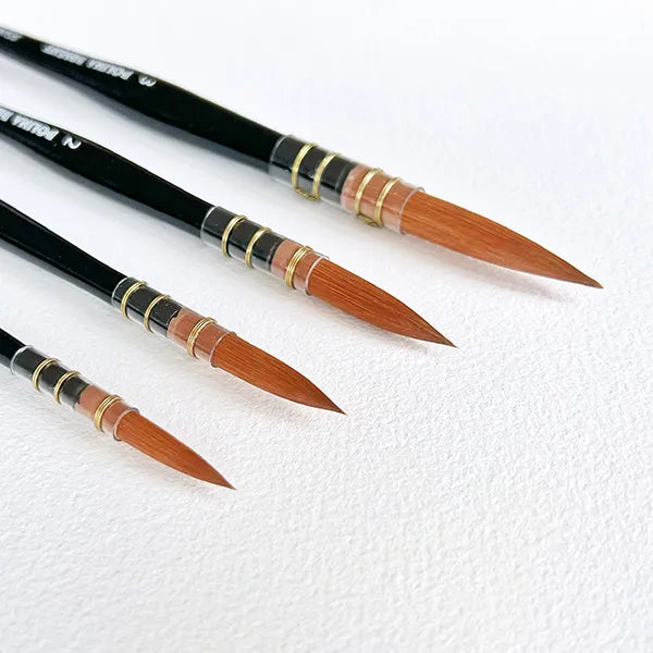
If you follow me on Instagram, you might have noticed that most of my watercolour paints come in tubes. I really prefer tubes over pans, because in my experience they are softer, oilier and easier to work with when using big amounts of water. In my latest works I’ve been dealing with large coloured areas, for example my Power over You collection, that’s why tubes worked really good for me. I can squeeze as much paint as I want on my palette and comfortably mix it with a lot of water as well as other colours.
I love every blue colour I have in my collection and I think each of them is very close to the colours you can see in the nature.
The list of all Blue tones in my watercolour palette
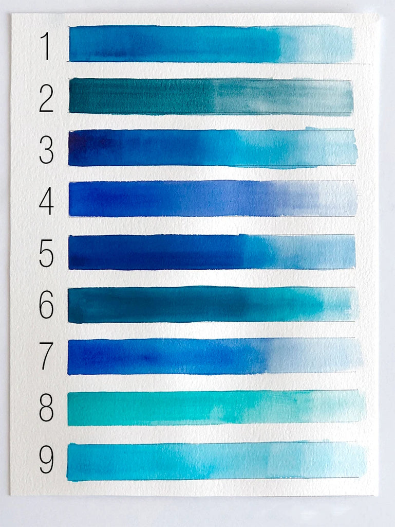
- Turquoise Series 1 by Winsor & Newton
- Mayan Blue Genuine Series 3 by Daniel Smith
- Intense blue (Phthalo blue) Series 1 by Winsor & Newton
- 506 Ultramarine Deep by Van Gogh
- 477 Phthalo Sapphire blue by Horadam Schmincke
- Phthalo turquoise Series 2 by Winsor & Newton
- 496 Ultramarine blue by Horadam Schmincke
- Cobalt turquoise light Series 4 by Winsor & Newton
- Manganese blue hue Series 2 by Winsor & Newton
Not all of these are in my everyday palette.
I use numbers 2, 4, 6 and 8 more often. Numbers 5 and 7 are brand new colours in my palette, and so far I’ve been enjoying them the most. What I love about them is their really strong, granulated and deep pigment. I usually start my work with a very light transparent layer. Then layer after layer I finish my work with the most saturated and deep one, so I find these two colours the best for that purpose.
Below I will give some more details on colours and will show you what painting I’ve used them in.
Winsor & Newton colours in my works
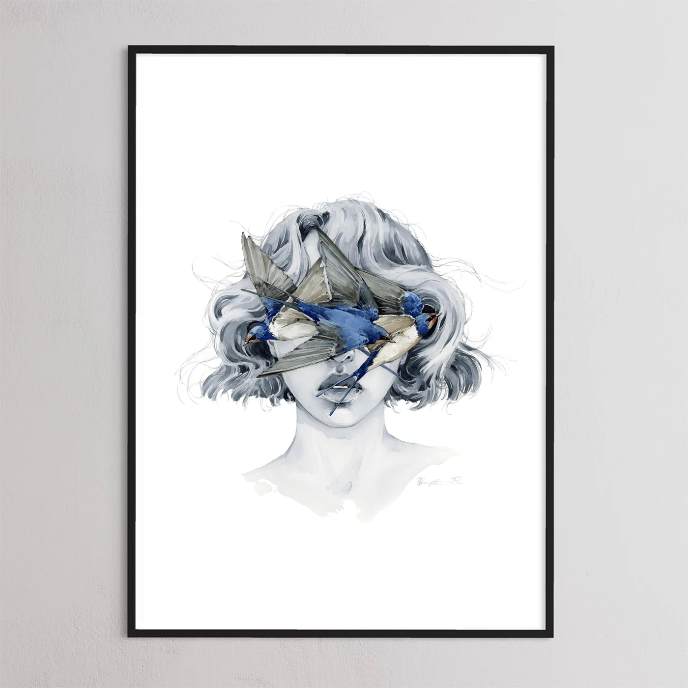
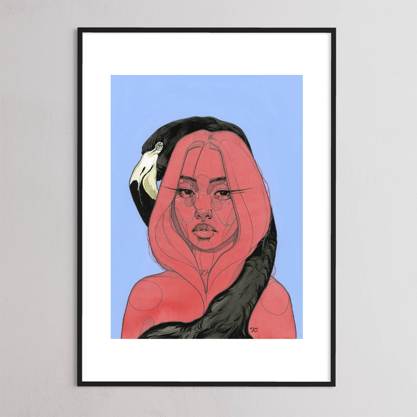
Turquoise (n.1) and 506 Intense blue (n.3) Series 1 by Winsor & Newton
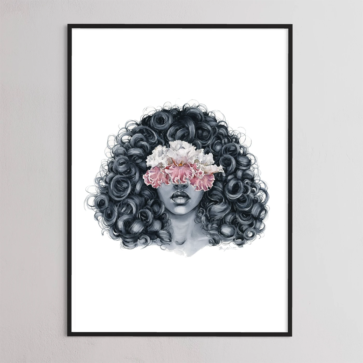
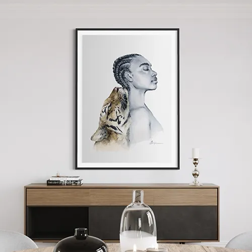
I find these colours to be very intense and bright. They both have blue pigment, the only difference is that turquoise color has also a green pigment (PG7). When I look at them, first thing that I’m thinking of is a Kingfisher with its very saturated blue back) I really like how they look on their own, so I mostly use them as they are without mixing with other colours.
One of the works I've used these colors in is from my Dreamy Ones collection - the Ice Peony : I've used the deep tones of Intense blue (n.3). And it was the best fit for it I think. I’ve also used a mix of turquoise (n.1) and ultramarine deep (n.4)

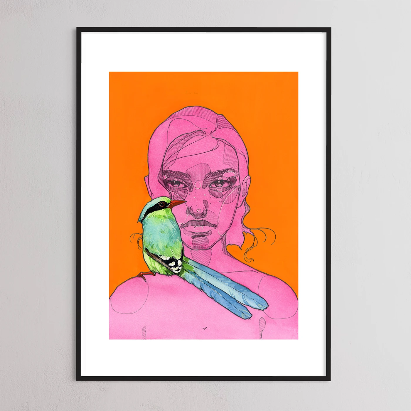
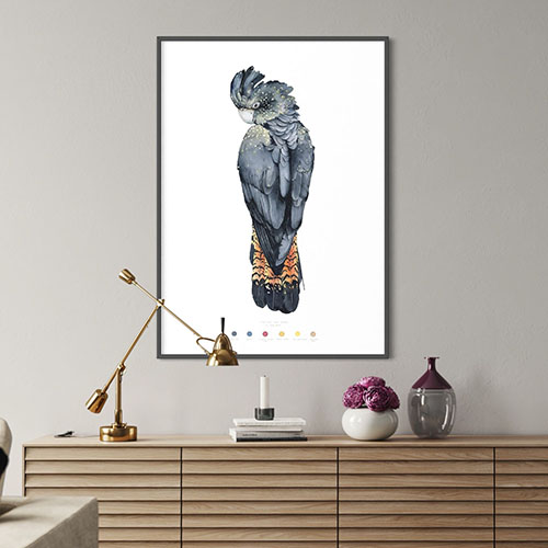
Cobalt turquoise light (n.8) Series 4 and Manganese blue hue (n.9) Series 2 by Winsor & Newton
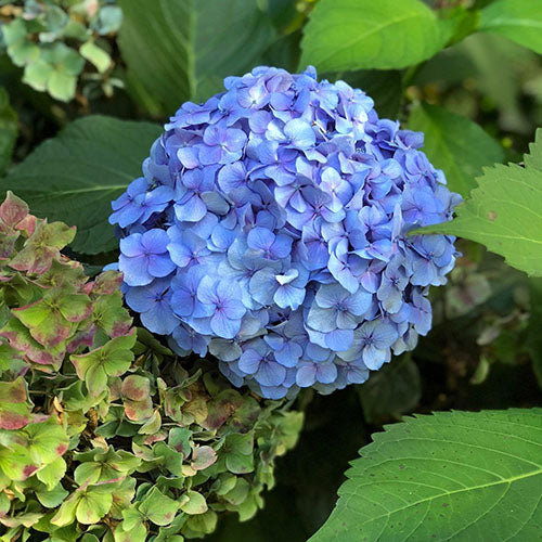
Each of these colours include a different pigment. Cobalt turquoise light (n.8) has a green pigment (PG50) and Manganese blue hue (n.9) has a blue pigment (PB15). For me, they both are very light, soft and pastel. And of course, they are the colours of my favourite Turquoise mineral or turquoise stone:

The next work is from my Animals collection. That’s a Gold Zebra. It has a very rare body colour and also very beautiful light blue eyes. I’ve used light tones of Manganese blue hue (n.1) here. For the feathers I’ve chosen a mix of Cobalt turquoise light (n.8) and Manganese blue hue with some grey tones for shading.

Van Gogh blues in my works
506 Ultramarine deep (n.4) by Van Gogh
I don’t know what I’d do without this colour in my palette, especially when painting this Octopus:

It’s clear, bright, transparent pigment (PB29) is gorgeous in application. Also, it's an excellent tool for mixing if you are looking for a beautiful tones of purples, lilacs and more. You can see how beautifully soft and silken it appears on the Octopus body.
Another example of a work where I have used this color:

Horadam Schmincke blues in my works
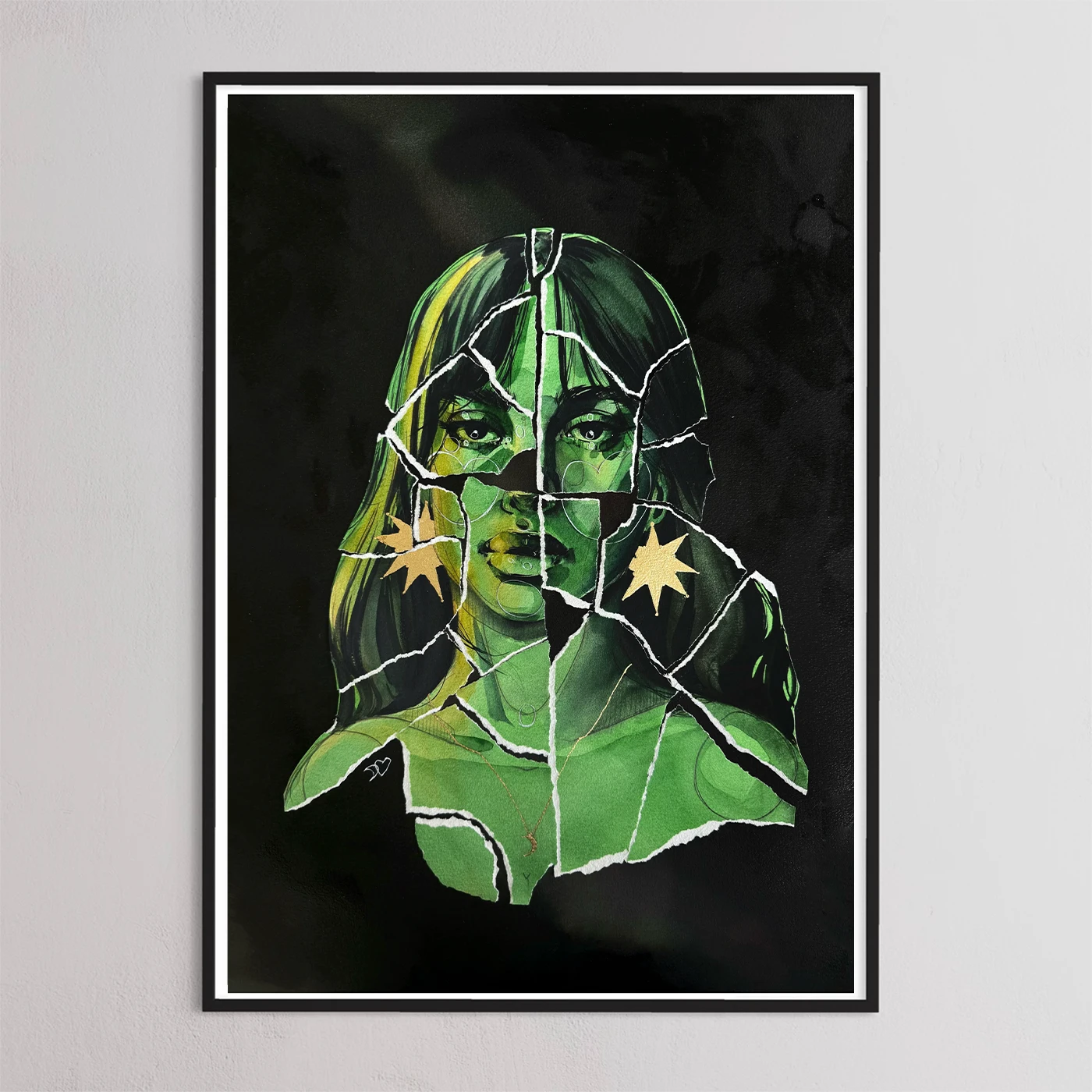
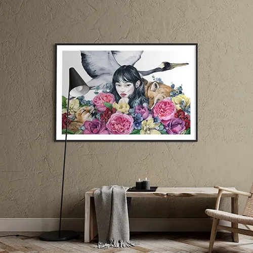
477 Phthalo Sapphire blue (n.5) and 496 Ultramarine blue (n.7) by Horadam Schmincke
lately these two have become my favourite blues. Their pigments are really smooth, strong and show themselves excellent in layering work.
I have used them in one of my latest works:

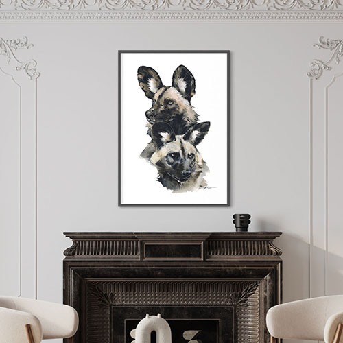
I have used a mix of Phthalo Sapphire blue (n.5) and Neutral tint Series 1 (W&N) to draw the bird’s head. I wanted to give a dramatic accent to the painting and these pigments played their role. For flowers I’ve used Mayan Blue Genuine Series 3 (n.2) with some grey tones. Also, that was the first time I have used Canson Heritage watercolor paper 300 gsm. These colours and this paper worked together to create the painting in temperate classical colours.
That's it :) Feel free to share, comment and like.
9 comments
Courtney DeRosa
Hi Polina,
I just bought a big print of yours and love it. Love your work. I’m trying to get into painting water colors myself. Do you have any tutorials posted? I’m new to this.
Courtney
Paula
Your art is amazing. Thank you for sharing your colors.
Francisca Assis
Bom dia, faz um curso gravado para s gente do início! Amo seu trabalho
Aguardo
Jerri
Enjoyed this post and seeing the swatches. Interested in seeing more.
MALENA
DEAR I am woman brazilian woman …but i need learn with you…How mutch for make courses with you in yur country I´, go in your counytru study in atelliert because I don´t like virtual reality….I LIKE TRAVEL Please answer me .KISSES
Leave a comment
All comments are moderated before being published.
This site is protected by reCAPTCHA and the Google Privacy Policy and Terms of Service apply.